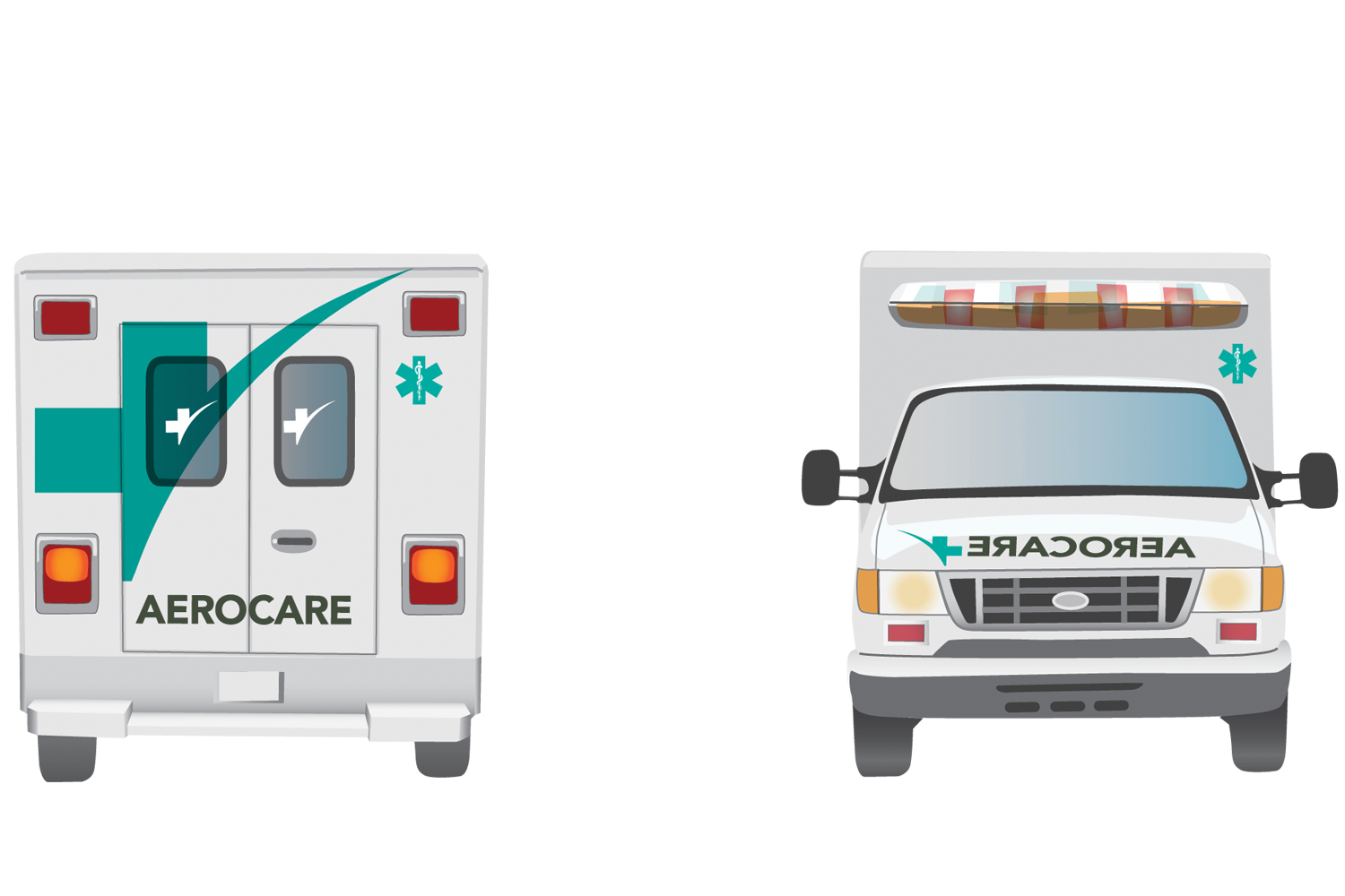
The project brief was to rebrand an airline. The airline I chose was Aerocare, a medical transportation company. My approach was to create an identity that conveyed the trust and professionalism that underpins the company philosophy.
The resulting identity combines medicine and the speed of transportation while also differentiating Aerocare from its competitors.
The logo is a key component of any brand which, in a single image can convey the mission, vision and values of the company or organization that it represents.
The logos here represent a selection of those created for the various projects in this website and some others. Each is a carefully researched and considered creation that went through many iterations before reaching its finished stage.
This illustration based project was a seasonal promotion for a local dog grooming company. At a time of year when business may be slower, these promotional post cards serve as a friendly reminder to dog owners to bring their furry friend for a bath and brush up.
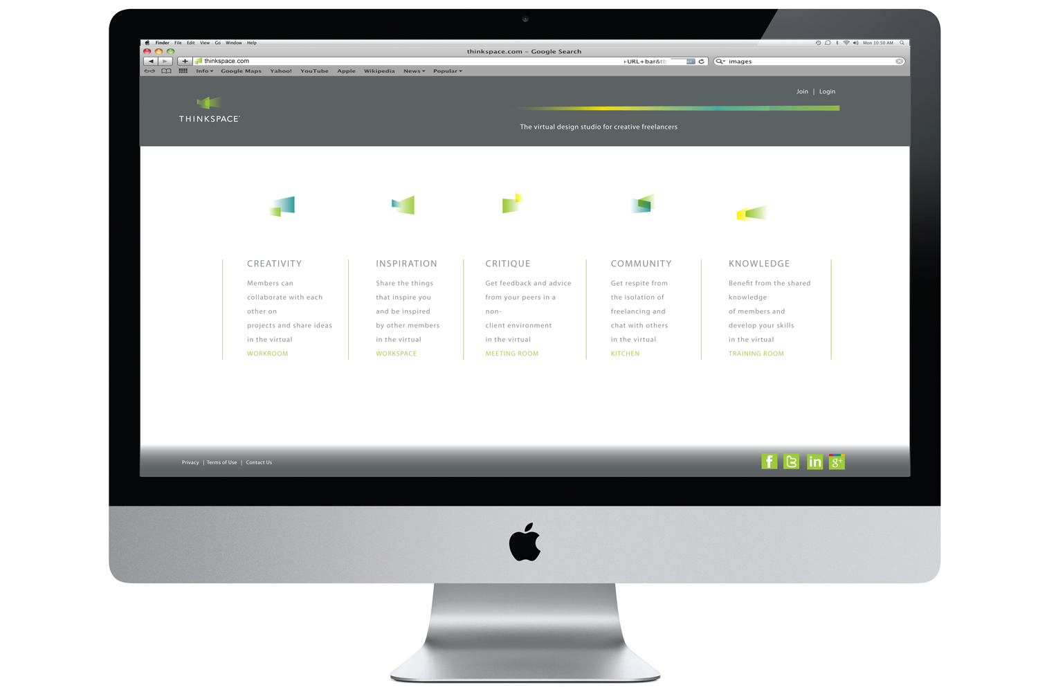
The aim of this project was to create an identity and promotional materials for an online community.
THINKSPACE is a virtual design studio for creative freelancers where they can benefit from the community and camaraderie of a 'bricks and mortar' studio from their own work location.
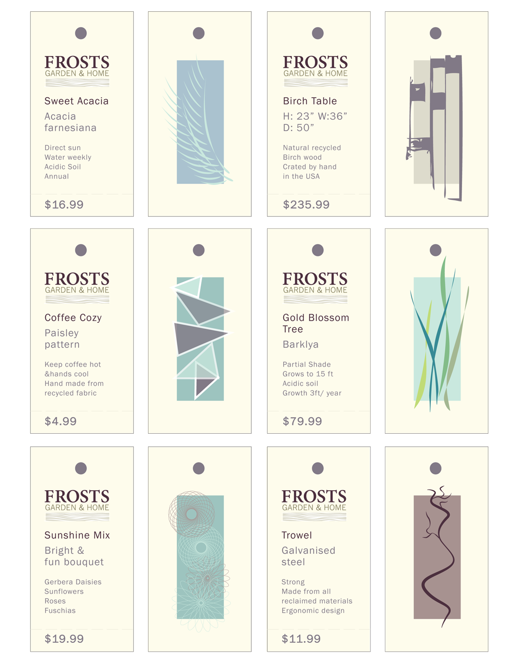
The project brief was to rebrand a retailer in a specialty which was unfamiliar to me.
Frosts Garden Center is a leading UK based gardening retail company. The rebrand was designed with the concept of a move into the US market. The aim of the look and feel wa to be sophisticated and memorable, aimed at the young professional target market in San Francisco.
The aim of this project was to translate information about a natural phenomenon into an identity, book and supporting materials.
The natural phenomenon I chose was the butterfly effect. This is another name for chaos theory. The material are based upon a hypothetical think tank called the Menelaus institute, named after the 'Menelaus Morpho' blue butterfly, the project explores the theories behind this fascinating subject.
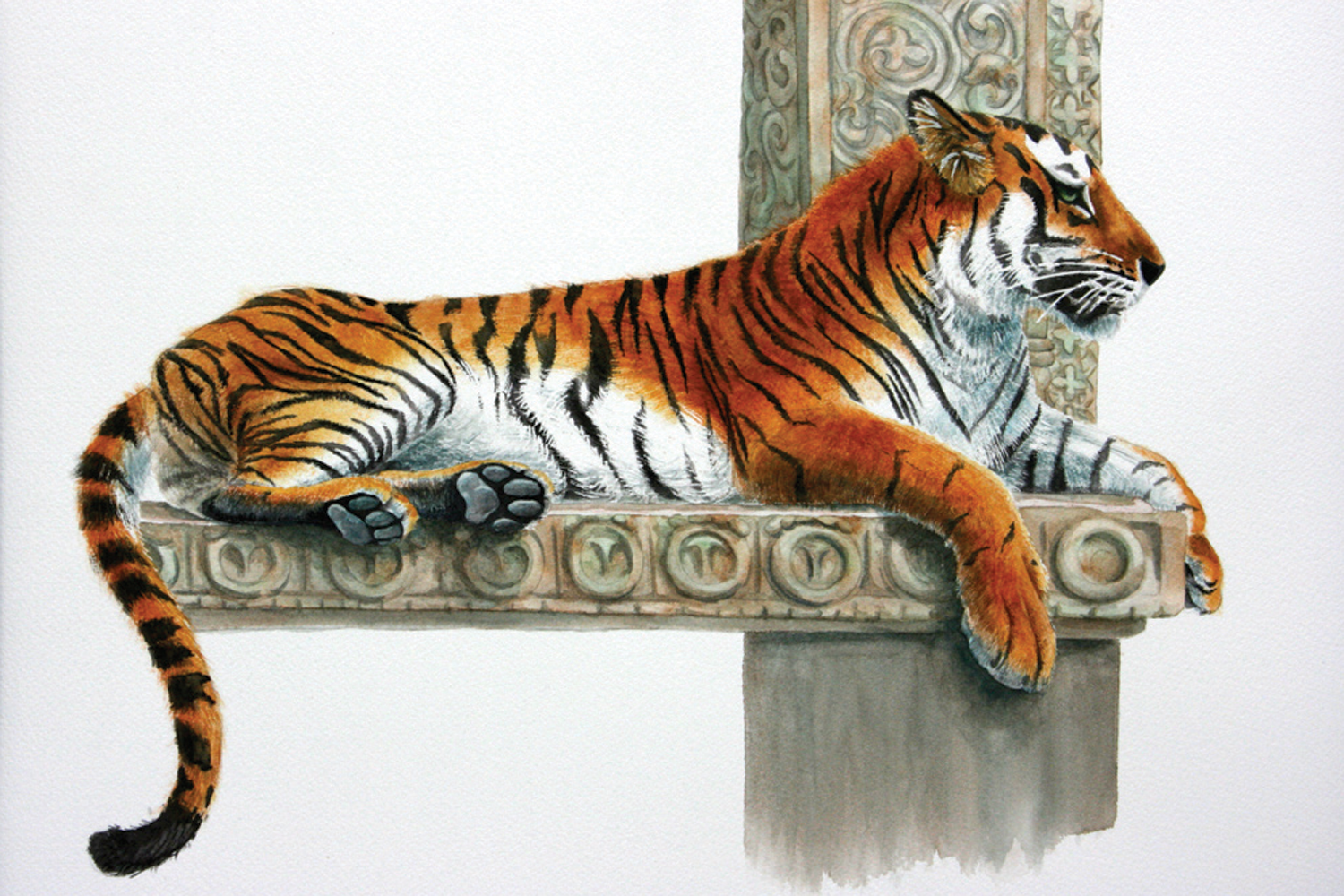
The sketchbook is a window into the thought processes of a designer and illustrator. A place for experimentation and exploration. Many ideas for future projects come from the pages of my sketchbooks.
The sketchbook is also a place to capture moments of inspiration. These images represent a small selection of my sketchbook pages.
The foundation for this project was the creation of a paper promotion. The system included a book which incorporated experimental typography and promotional items which showcase the paper itself and the underpinning message of the paper line.
The paper company is Neenah, the paper line is Environment. The underlying theme is the survival of nature in urban environments.
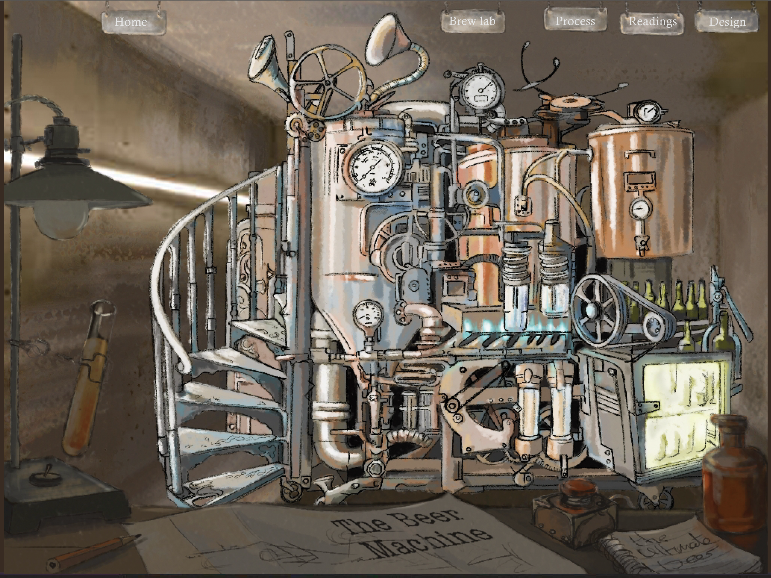
The starting point for this project was a search for an item offered for free on Craig's list. From there I created a website that focused on the user experience to drive the design and interactive elements of the site.
The solution was a fun approach aimed at the inventor of unique home brewed beers created in a home laboratory. The user can explore the possibilities of beer brewing with interactive recipe builders and even design their own bottle labels and caps.
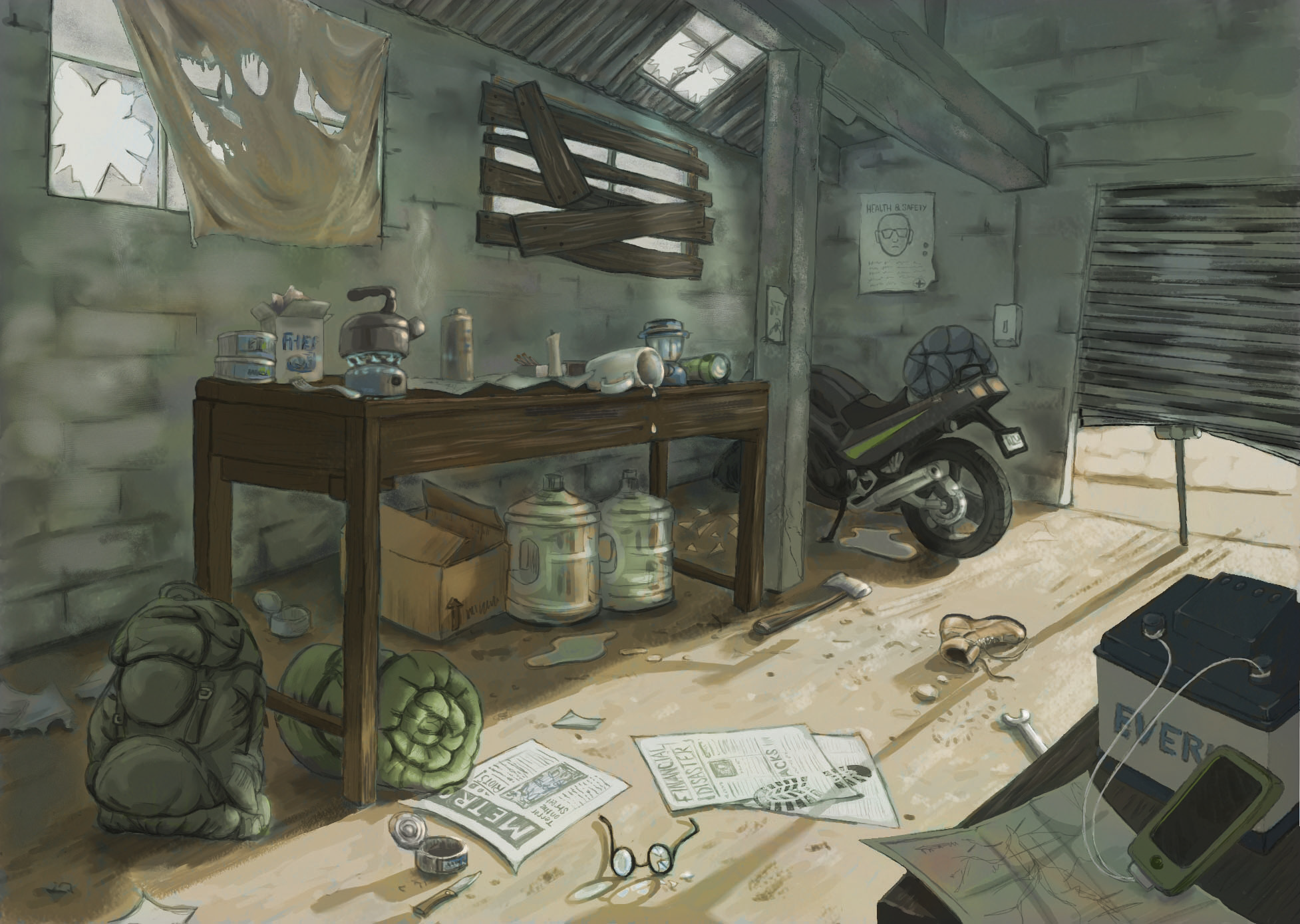
This digital illustration project tells a story in a single image without using any people or animals in the image.
The scene is one of a mystery, with clues and hints that if observed carefully tell a story of survival and struggle in a world that could be now or in the future.
Many visual communication problems can be best solved with an illustration. An illustration has the ability to inform or intrigue the viewer, to represent real life or a fantasy world.
Whatever the medium of the illustration, there is always element of the human factor, the hand creation of an image that is only limited by the imagination of its creator.